نماد عشق یک قلب است. اما نماد عاشقی قلبی هست که تیر وسطش خورده. کمتر کسی شاید راز این قلب تیر خورده را بداند. لااقلمن در اینترنت هر چه گشتم نه به فارسی و نه به انگلیسی در این زمینه چیزی ندیدم. در نتیجه خودم مینویسمش تا هر کسی دنبال معنایش گشت، جوابش را اینجا پیدا کند. در باور یونانیان باستان هر پدیده ای یک خدایی داشت. همه خدایان هم یک خدا یا پادشاه بزرگ داشتند که اسمش زئوس بود. یک شب به مناسبتی زئوس همه خدایان را به جشنی در معبد کوه المپ دعوت کرده بود. دیوانگی و جنون هم خدایی داشت بنام مانیا. مانیا چون خودش خدای دیوانگی بود طبیعتا عقل درست و حسابی هم نداشت و بیش از حد شراب خورده بود. دیوانه باشی، مست هم شده باشی. چه شود!  خدایان از هر دری سخنی میگفتند تا اینکه نوبت به آفریدیته رسید که خدای عشق بود. حرفهای خدای عشق به مذاق خدای جنون خوش نیامد و این دیوانه عالم ناگهان تیری را در کمانش گذاشت و از آنسوی مجلس به سمت خدای عشق پرتاب کرد. تیر خدای جنون به چشم خدای عشق خورد و عشق را کور کرد. هیاهویی در مجلس در گرفت و خدایان خواستار مجازات خدای جنون شدند. زئوس خدای خدایان مدتی اندیشه کرد و بعد به عنوان مجازات این عمل، دستور داد که چون خدای دیوانگی چشم خدای عشق را کور کرده است، پس خودش هم باید تا ابد عصا کش خدای عشق شود. از آن زمان به بعد عشق هر کجا میخواهد برود جنون دستش را میگیرد و راهنماییاش میکند. به همین دلیل است که میگویند عشق کور است و عاشق دیوانه و مجنون میشود. پس تیر و قلب و نقش این دل تیر خورده ای که میبینید ریشه در اسطوره های یونان باستان دارد. بعدها رومیان باستان آیین و اسطوره های یونانیان را پذیرفتند و تنها نام خدایانشان را عوض کردند. در افسانههای روم باستان زئوس را ژوپیتر، خدای جنون را ارا و خدای عشق را ونوس مینامیدند. در نتیجه به باور آنها ارای دیوانه چشم ونوس زیبا را کور کرد. عشق واقعا جنون است اما اگر دو طرفه و واقعی باشد لذتی دارد که مپرس. ولی عشق یکطرفه انسان را پریشان و خوار و حقیر میکند. |
Showing posts with label History. Show all posts
Showing posts with label History. Show all posts
Wednesday, June 23, 2010
دوست دارید بدانید که چرا نماد عاشقی قلبی هست که تیر وسطش خورده است


Friday, February 19, 2010
The History of the Ampersand and Showcase

Typography designers can exercise a lot more artistic freedom in the design of the ampersand, ranging from very traditional representations to those that bear little resemblance to the original form.
But many designers have little knowledge about the origin and meaning of the ampersand. The ampersand has a long and rather interesting history, though.
And with all the variations available out there, there are a whole host of design possibilities presented by this particular character.
Read on for more information, a history of the ampersand, and a gallery of ampersand designs from a variety of different typefaces.
A Brief History of the Ampersand
The ampersand can be traced back to the first century AD. It was originally a ligature of the letters E and T (”et” is Latin for and). If you look at the modern ampersand, you’ll likely still be able to see the E and T separately.
The first ampersands looked very much like the separate E and T combined, but as type developed over the next few centuries, it eventually became more stylized and less representative of its origins.
You can see the evolution of the ampersand below (1 is like the original Roman ligature, 2 and 3 are from the fourth century, and 4-6 are from the ninth century).
The modern ampersand has remained largely unchanged from the Carolignian ampersands developed in the ninth century.

Italic ampersands were a later ligature of E and T, and are also present in modern fonts. These were developed as part of cursive scripts that were developed during the Renaissance. They’re often more formal-looking and fancier than the standard Carolignian ampersand.
The word “ampersand” was first added to dictionaries in 1837. The word was created as a slurred form of “and, per se and”, which was what the alphabet ended with when recited in English-speaking schools. (Historically, “and per se” preceded any letter which was also a word in the alphabet, such as “I” or “A”. And the ampersand symbol was originally the last character in the alphabet.)
The ampersand is a part of every roman font. It’s used in modern text often, probably most frequently in the names of corporations and other businesses, or in other formal titles (such as Dungeons & Dragons).
It’s experiencing a bit of a resurgence in general usage, as it commonly replaces “and” in text messages and Twitter updates. Ampersands are also commonly used in programming, particularly in MySQL, C and C++, XML, SGML, and BASIC.
Ampersand Designs
The original ampersand designs reflected their origins as a ligature of E and T. Even as the ampersand has evolved and become more stylized, it still retains the basic shape of E and T combined.
The standard ampersand most of us are used to seeing is the Carolignian variety, and is featured in many commonly-used fonts. Here are some examples:

Andale Mono – A very traditional, sans-serif example.
 Apple Chancery – A fancier, serif example.
 Kingthings Petrock - A gothic example.
The other common ampersand design is the italic ampersand, featured below:
 Monotype Corsiva – A traditional script example.
 Scriptina - A less-formal script example.
 Aller Dispay – A modern, sans-serif example.
 Hill House – A craftsman-style example.
Ampersands in Websafe and Web-Common Fonts
Some websafe and commonly used fonts on the web have excellent ampersand designs. Others, not so much. Here are the ampersands from a variety of web-common fonts:
 Arial – Arial has a very basic, sans-serif ampersand.
 Georgia - A very traditional, serif ampersand.
 Helvetica – Helvetica’s ampersand is slightly more refined than Arial.
 Palatino – Another very traditional example.
 Times New Roman – A heavy, somewhat bulky-looking ampersand.
 Verdana – The verdana ampersand is more squat and square than many other sans-serif examples.
 Trebuchet MS – The only web-common font that uses an italic-style ampersand.
If you’re unhappy with the ampersand in a font you’ve chosen for your website, there are ways to use custom ampersands. The Typogrify plugin for WordPress makes it incredibly easy to use a custom ampersand on your WordPress blog.
The Ampersand in Design and Art
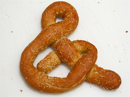
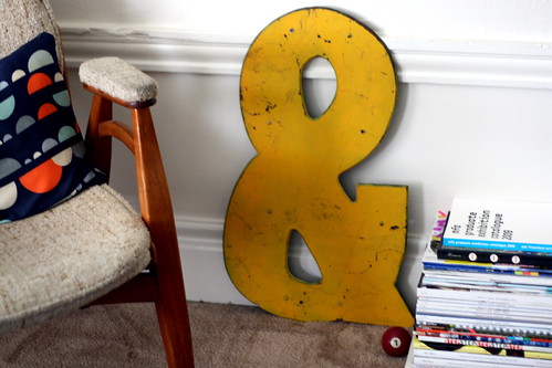
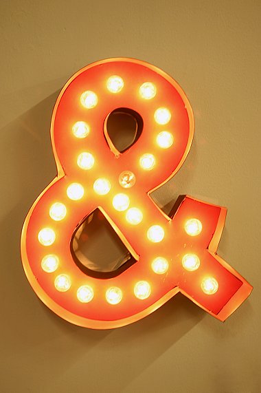
Ampersands have become a bit of an obsession for some. There are blogs that focus on ampersands (some within larger typography blogs, others focusing solely on the ampersand). There are t-shirts. And there are a surprising number of people out there who have ampersand tattoos. Here are some examples of ampersands in real life:








Using Ampersands in Your Designs
Whether for a web project or a print design, ampersands can play a prominent role in the look and feel of your website. When used in titles or headers they can add some extra graphic impact without images.
Italic ampersands, which are generally formal and fancy, can add extra elegance to a design that otherwise remains minimal. Carolignian ampersands in a sans-serif font are often bolder and have a modern feeling.
Carolignian ampersands in a serif font have a very traditional feeling, though depending on the specific font they can become more formal or more modern. A few more examples:
Italic Ampersands
 Lucida Handwriting
 Papyrus
 Windsong
 Goudy Bookletter 1911
 Bernhard Modern
 Caviar Dreams
Carolignian Ampersands
 Lithos Pro
 Tahoma
 Optima
 American Typewriter
 Regency Script
Further Information
Here are some additional resources, and sources used in the crafting of this post.
- 112. Ampersand – A short but excellent history from Art Lebedev Studio.
- Ampersand – Wikipedia’s entry on the ampersand.
- The Ampersand – Adobe’s history of the ampersand.
- The Ampersand – An entire blog devoted to real-life examples of the ampersand.
- Ampersand Typography – Another blog devoted to ampersand examples, particularly historical ones.
- The Funkiest Ampersands You Have Ever Seen – An excellent roundup of unusual ampersand designs from Spoon Grahpics.
- The Mesmerizing Curves of Ampersands – Another excellent roundup of ampersand designs, with download links. -
Written exclusively for WDD by Cameron Chapman. Read more...
Subscribe to:
Posts (Atom)


